# Modal Dialogs
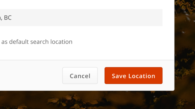
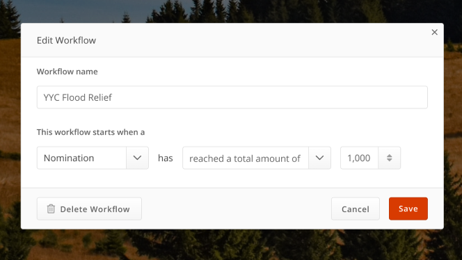
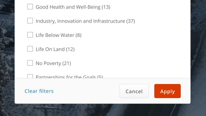
A modal hidden behind a trigger to share or capture additional information without removing the user from the flow of the page
# Design Best Practices
Do


Avoid
Don't
# Layout & Spacing
# Example
# Modal Base
# Modal with Header and Footer
# Modal with Autofocus Element
By default the modal dialog will self-focus on the first focusable element
inside the modal dialog (the close button). If you need focus to start on a different
element when the modal dialog opens you can place the autofocus attribute
on any focusable element.