# Forms
Capture user input to save and validate.
# Design Best Practices
Do
Avoid
Don't
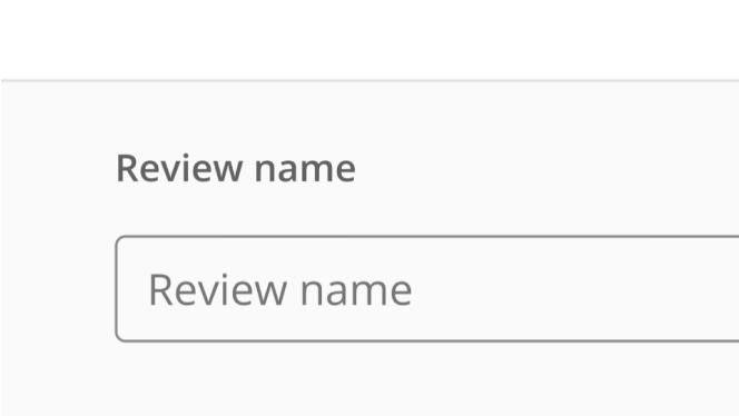
# Placeholder Text
Do
Avoid
Don't
# Accessibility
# Layout & Spacing
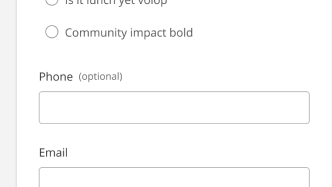
# Form Elements
Text Area Input
Text Area Input
Allows a user to enter text that could take up multiple lines
Select Input
Select Input
Allows a user to select a single value from a list of options
Single-select Input (with autocomplete)
Single-select Input (with autocomplete)
Allows users to select a single value from a predefined list of options, with the ability to filter the list of options.
Multi-select Input (with autocomplete)
Multi-select Input (with autocomplete)
Allows users to select multiple items from a predefined list, with the ability to filter the list of options.
File Uploader
File Uploader
An uploader with a responsive file management interface and error handling
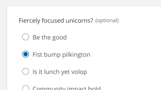
Radio Toggle Bars
Radio Toggle Bars
Allows a user to select one option from two or more options in a group to trigger an immediate change in their user interface