# Color
Discover how we use color at Benevity
# How to
To use the Skyline SCSS functions you will need the following file imported before they are used.
// As long as this file is imported you can use any Skyline SCSS functions or mixins
@import '~@skyline/scss/src/core/UI.required';
p.i-want-this-paragraph-to-be-gray-300 {
  color: get-gray(300);
}
# Grays
| Name | Use on White | Use on Gray 200 | Example on White | Example on Gray 200 |
|---|---|---|---|---|
| Gray 100 | No | No | #fafafa | #fafafa |
| Gray 200 | No | No | #f5f5f5 | #f5f5f5 |
| Gray 300 | No | No | #e0e0e0 | #e0e0e0 |
| Gray 400 | No | No | #bdbdbd | #bdbdbd |
| Gray 500 | No | No | #8b8b8b | #8b8b8b |
| Gray 600 | Yes | No | #757575 | #757575 |
| Gray 700 | Yes | Yes | #616161 | #616161 |
| Gray 800 | Yes | Yes | #424242 | #424242 |
| Gray 900 | Yes | Yes | #333333 | #333333 |
# Hues
| Name | Use on White | Use on Gray 200 | Example on White | Example on Gray 200 |
|---|---|---|---|---|
| Green | Yes | Yes | #1a801b | #1a801b |
| Green Light | No | No | #f4fce3 | #f4fce3 |
| Yellow | No | No | #fcc419 | #fcc419 |
| Yellow Light | No | No | #fff9db | #fff9db |
| Red | Yes | Yes | #ce3232 | #ce3232 |
| Red Light | No | No | #fff5f5 | #fff5f5 |
| Blue | Yes | Yes | #106fa4 | #106fa4 |
| Blue Light | No | No | #deeff8 | #deeff8 |
| Purple | Yes | Yes | #8a5ca2 | #8a5ca2 |
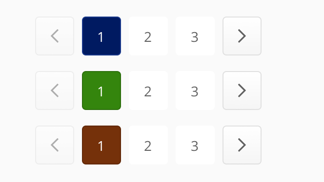
# Theme Colors
Theme colors are used to infuse a client’s brand into Benevity’s products to help it feel familiar. Unlike Grays and Hues, which do not change, theme colors will change if the product supports configurable theme colors and the client prefers to use their own colors over Skyline’s defaults.
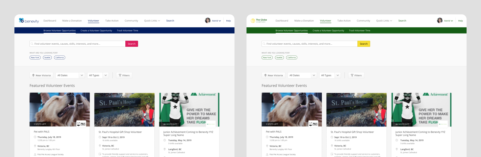
# Themes Across Products
Products that support client-configured theme colors:
- Spark
- Benevity Grants application forms
- Community Impact Portal
Products that use Skyline’s default theme colors:
- Causes Portal
- Benevity Grants
- Versaic by Benevity
- Spark native mobile apps
# Brand Color Uses
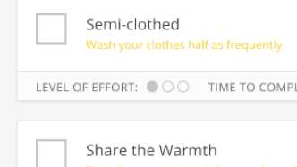
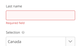
The Brand color is often used to highlight interactive elements. It should be a dark color to meet the color contrast minimums for WCAG AA 2.1 (opens new window).
| Default | Hover* |
|---|---|
#001a61 | #19388b |
* Automatically calculated based on the default color provided.


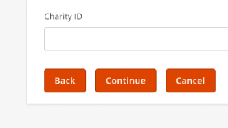
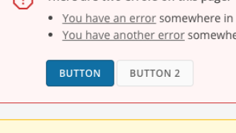
# Action Color Uses
The Action color is used for primary action buttons. It can be any color, paired with Black or White text, to meet the color contrast minimum for WCAG AA 2.1 (opens new window).
| Default | Hover* |
|---|---|
#de175c | #c21954 |
* Automatically calculated based on the default color provided.


White Label Utility Classes
Theme colors for your HTML
Configurable Color Settings
Try different options
# Design Best Practices
Aim To
Avoid
Don't