# Spacing
Consistency and visual alignment across our products
# Spacing Grid
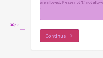
We use a 4px increment system rather than hard coded values for padding and margin. This creates rhythm between elements, is easier to maintain and saves time during QA.
| Skyline Value | Pixels | Example |
|---|---|---|
| 100 | 4px | |
| 200 | 8px | |
| 300 | 12px | |
| 400 | 16px | |
| 500 | 20px | |
| 600 | 24px | |
| 700 | 28px | |
| 800 | 32px | |
| 900 | 36px | |
| 1000 | 40px | |
| 1200 | 48px | |
| 1400 | 56px | |
| 2400 | 96px | |
| 4000 | 160px |
# Component Scales
Used for spacing within individual components. Smaller units are included to provide more control over spatial relationships.
| Skyline Value | Pixels | Example |
|---|---|---|
| 100 | 4px | |
| 200 | 8px | |
| 300 | 12px | |
| 400 | 16px | |
| 500 | 20px | |
| 600 | 24px | |
| 700 | 28px | |
| 800 | 32px | |
| 900 | 36px | |
| 1000 | 40px |
# Layout Scales
Used for spacing components at the page level. Larger increments are included to allow for appropriate use of whitespace within a layout.
| Skyline Value | Pixels | Example |
|---|---|---|
| 600 | 24px | |
| 800 | 32px | |
| 1200 | 48px | |
| 2400 | 96px | |
| 4000 | 160px |
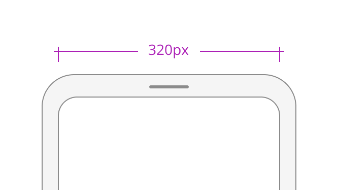
# Breakpoints
We use the sass-mq (opens new window) mixin so that you can easily reuse breakpoints across our products.
| Name | SassMQ Variable Name | Value |
|---|---|---|
| Portrait Phone | portrait-phone | 0px |
| Landscape Phone | landscape-phone | 550px |
| Portrait Tablet | portrait-tablet | 768px |
| Landscape Table | landscape-tablet | 990px |
| Small Desktop | small-desktop | 1025px |
| Desktop | desktop | 1280px |
| Large Desktop | large-desktop | 1440px |
| Very Large Desktop | very-large-desktop | 1850px |
# Design Best Practices
Aim To
Avoid