# Vertical Rhythm
Create consistent spacing between vertical elements on the page with our layout tooling.
# Vertical Rhythm 101
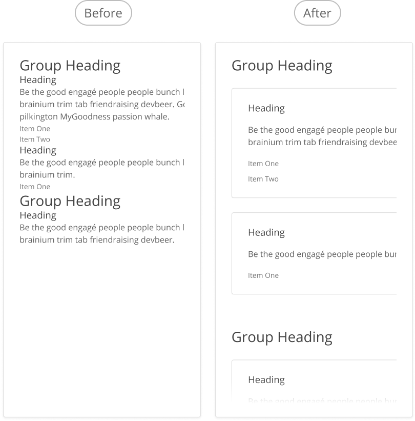
Vertical rhythm is a core design principle. It helps users differentiate between information that is related, and where new content starts.
We use larger spacing to separate main sections of content, and smaller spacing when the items are related to each other.
# Introducing the Stack
At Benevity, when we need one part within the page to have the same level of vertical spacing, we use the Stack object.
- For designers, this might be a group or frame within a Figma design.
- For developers, this might be a
divorsectionelement that is grouping related parts of the code together.
Unsure if the Stack is right for your situation? Ask yourself these questions:
- Is the spacing I need vertical?
- Do I need to space out more than two things?
- Are these things adjacent to each other on the page / in the DOM?
- Do I need to space these items with the same value?
- Are these thing related to each other?
If you answered "no" to these questions, you might be better off using a margin spacing value. And if you're unsure if you should use a Stack, this would be a great time for a developer and designer teaming up for some design pairing!
# Design Best Practices
Aim To

Avoid
# The Stack in Figma
Designers can manually name layers in Figma to show where Stacks are used. The name is applied to the parent group, or Auto Layout frame, to highlight which nested element is receiving the vertical rhythm.
| Figma Layer Name | Pixels | Common Usage | Code |
|---|---|---|---|
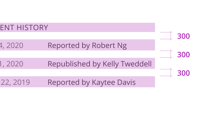
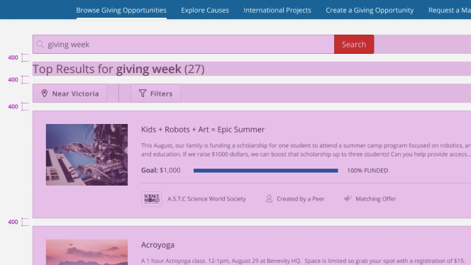
| 🏙 Stack 300 | 12 px | Between text labels. | class="o-stack o-stack--300" |
| 🏙 Stack 400 | 16 px | Between content in card sections. | class="o-stack o-stack--400" |
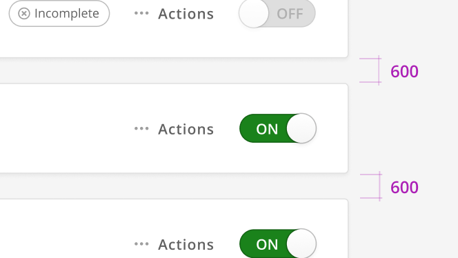
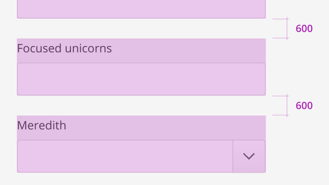
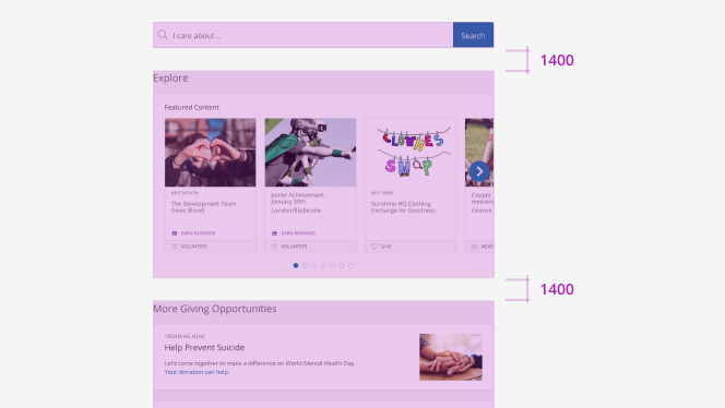
| 🏙 Stack 600 | 24 px | Between cards or form elements. | class="o-stack o-stack--600" |
| 🏙 Stack 1400 | 56 px | To separate large groups of content. | class="o-stack o-stack--1400" |