# Single-select Input (with autocomplete)
Allows users to select a single value from a predefined list of options, with the ability to filter the list of options.
# Usage
Do
Don't
# Design
For general form guidelines, view the design best practices for forms.
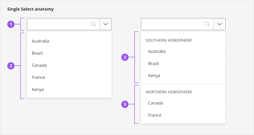
# Anatomy

- Input field
- Dropdown with list of options (default)
- Dropdown with grouped options
# Style
# Input field
- The input field inherits the same styling as the standard select input form field, with the addition of a magnifier icon to indicate the user can type to filter options.
- When an option is selected, the magnifier icon is replaced by a clear selection clickable icon.

# Dropdown
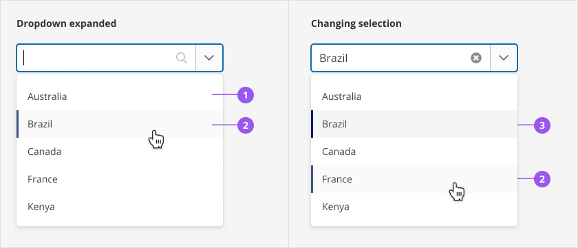
When active, a dropdown displays the list of options from which a user can make a selection. List options have three states with corresponding visual styling:
- Default (deselected) state
- Hover state
- Selected state

| Option state | Text | Background colour | Stroke (left) |
|---|---|---|---|
| 1. Default (deselected) | SkyText - Gray 800 | None | None |
| 2. Hover | SkyText - Gray 800 | Gray 100 | 3px - Brand at 75% opacity |
| 3. Selected | SkyText - Gray 800 | Gray 200 | 3px - Brand |
# Grouped options
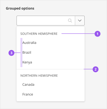
Grouped options include the following:
- A group label in SkyText Caps, in Gray 800
- A divider line between groups, in Gray 300
- 8px of additional left padding next to options

# Sizing
Avoid making the field full-width, if possible. Align the size of the single-select field with the width of options in the list, with some room to spare.
# Spacing
The single-select component can be used with the SkyInputContainer component to provide layout and spacing specifications when combined with other common input details like a label, description, error message, etc.
# Content
General guidelines for form fields apply.
The component has the following labels built in:
- The aria-label for the clear selection clickable icon
- The screen reader announcements that are built in
- The aria-label for options when they are currently selected
- The default content shown when no results are found
# Behaviours
# Interactions
| User Interaction | Description |
|---|---|
| Entering the input field | When a user enters the field, the options are expanded and the focus remains on the input, ready for the user to start typing or interacting with the field. If there is an option selected already, all options are shown and the selected option is preselected when the options are expanded. |
| Interacting with the options | When a user hovers over an option or uses the keyboard to browse the options, the visual styling of the option shows this interaction |
| Selecting an option | A user must explicitly choose an option from the list by clicking or pressing Enter or Space on an option. When a user selects an option, the list of options is collapsed, the input has the label of the option, and the focus is kept on the input. The clear selection clickable icon is also shown when an option is selected. |
| Filtering and autocomplete | By default, all options are shown when the list is expanded. Once a user types 1 character, the list of options will only show items that have a word starting with that character. Once a user types 2 or more characters, items that include the character combination are included. Filtering behaviour is not case sensitive. |
| No results | If what the user types does not match any of the options, a message communicating no results found is displayed. |
| Grouped options | Options can be displayed in groups with a label. The label for the group cannot be selected. The label of the group is not included in the filtering behaviour, but is displayed if an option within that group matches the text in the field |
| Clearing a selection | A clear selection clickable icon is shown that will clear the selected option when pressed. This button is only shown if there is an option selected and if the field is not disabled. |
| Dropdown arrow | When collapsed, pressing the dropdown arrow will focus on the single-select to receive typed input and expand the options. When expanded, pressing the dropdown arrow will close the options |
| Invalid option | If a user types an invalid option, the input is cleared when the user moves away from the field (on blur) |
| Typing after a selection | If an option is already selected and text is added to the input, the selected option is removed and the clear selection clickable icon is no longer displayed. The user will have to make a new selection. |
| Keyboard interactions | For more information, see details in the Keyboard interactions section |
# Responsive behaviours
The single-select component has the same behaviour at all breakpoints.
# Scrolling behaviour
The single-select has the following scrolling behaviour:
- When the options are expanded, a maximum of 10 options are shown before the options are scrollable
- When an option is selected and the options are then expanded, the selected option is scrolled into view
- The options scroll as a user browses through the options using the keyboard
- When options are filtered, the user is scrolled to the top of the options
# Edge cases
- Long labels for options and groups: Options with long labels wrap as necessary and no truncation is applied
- Long option selected: When an option with a long label is selected and shown in the field, an ellipsis is shown. When the field is in focus, the ellipsis is removed
- Long placeholder text: When the placeholder text is long, it shows an ellipsis. When the field is in focus, the ellipsis is removed
# Accessibility
# What Skyline provides
The single-select component applies the W3C ARIA Authoring Practices Guide (APG) for the combobox pattern (opens new window) and listbox pattern (opens new window), specifically in terms of focus management, keyboard interaction, and HTML semantics and attributes. This section focuses on what has been implemented, since not all of the optional guidelines and interactions were added. Announcements have also been added to improve the experience for screen reader users.
# Focus management
When a user is interacting with the single-select, the DOM focus is kept on the input field. Assistive technology focus is managed within the list using aria-activedescendant and aria-selected attributes to ensure the options are still read out when browsing the options (see W3C ARIA APG: Managing Focus in Composites Using aria-activedescendant (opens new window) and the HTML Semantics and attributes section for more details). When the list of options is expanded, the assistive technology focus is kept within the options until an option is selected or the options are collapsed. The assistive technology focus follows the option that is preselected.
# Keyboard interactions
The following are the general keyboard interactions with the single-select:
| Keyboard Interaction | Description |
|---|---|
Tab and Shift+Tab |
|
Printable characters | Adds text to the input field. By default, all options are shown. After characters are typed, options are filtered to match the text. See Interactions for more information about filtering. |
Backspace | Removes the previous character (if there is one). Filtered options are updated, if needed, to only show the options that match the text in the input. |
Space | If the user’s last interaction was typing a printable character, pressing space will add a space to the typed text in the input |
Escape | Clears the input if no option is selected and there is text in the input. Options are collapsed. |
Left arrow or Right arrow | Moves the text cursor within the input left and right. Typing printable characters after will be inserted in the new cursor position |
The following are the keyboard interactions available when the options are expanded:
| Keyboard Interaction | Description |
|---|---|
Enter | Selects the preselected option (see Interactions for more details on the behaviour when an option is selected) |
Space | Selects the preselected option if the user’s last interaction was not typing a printable character |
Escape | Closes the options. If there is no option selected, the text in the input is also cleared. If an option is selected, it is not cleared unless the options are already collapsed. |
Up arrow or Down arrow | Moves the preselected option (and the assistive technology focus) to the previous or next option.
|
The following are the keyboard interactions when the options are collapsed:
| Keyboard Interaction | Description |
|---|---|
Enter | Expands the options |
Space | Expands the options, assuming the user’s last interaction was not typing a printable character |
Escape | Clears the selected option |
Up arrow | Expands the options and if there is not a selected option, the last item is preselected. Otherwise, the option before the selected option is preselected |
Down arrow | Expands the options and if there is not a selected option, the first item is preselected. Otherwise, the option after the selected option is preselected |
Printable characters | Adds text to the input and expands the options. Options are filtered based on the characters typed |
# HTML semantics and attributes
Implemented HTML semantics to highlight:
<input>is used for the element that the user interacts with to expand and filter options. It also shows the selected option.
The single-select component follows the Combobox Pattern (opens new window) with the Listbox Pattern (opens new window) for the list of options. The following attributes are used:
- Combobox
role=comboboxon theinputelementaria-controlsis set to the id of the listbox popuparia-haspopupis set tolistboxaria-expandedis set totrueif the options are expanded, andfalseif the options are collapsedaria-activedescendantis set to the id of the element that is currently preselectedaria-autocompleteis set tolistaria-labelledbyis set to the labelledBy prop (this should be the id of the label for the input field)
- Listbox
role=listboxon the popup element that has the list of optionsaria-labelledbyis set to the labelledBy prop (this should be the id of the label for the input field)
- Option
role=optiondefines the items in the listbox that are the options for the single-selectaria-selectedis set totrueif the option is preselectedaria-labelis set on the option if it is the current option selected. It specifies the label and that it is selected.
- Option Group
role=groupidentifies a group containing a label and related optionsaria-labelledbyon a group is set to the element id of the group label
- Other
aria-labelis set for the clear selection clickable iconrole=presentationandfocusable=falseis set on the presentational icons (the magnifier icon in the input field and the arrow icon in the dropdown)tabindex=-1andaria-hiddenon the dropdown button is applied so it is not included in the tab order. This is because it is redundant since it only triggers the input field, which is the focusable element previous to the dropdown button
# Announcements
The following announcements have been added to the single-select to improve the screen reader experience:
- When a user enters the field, instructions are announced on how to navigate and select an option using the keyboard
- When options are filtered, the number of results available is announced along with the instructions on how to navigate and select an option
- When an option is selected, it is announced that the option is selected
- When a user clears the selection, it is announced that the selection was cleared
# Reduced motion
When an option is selected, there is a brief, subtle background colour animation behind the selected option in the input. If a user has a preference for reduced motion, the background colour animation is not shown.
# Development guide
For general best practices around accessibility and forms, review the Forms guidelines
# HTML semantics and attributes
- Use SkyInputContainer with the single-select component to ensure the input field has the proper semantics and attributes with things provided by the input container like labels, descriptions, errors, etc. Refer to the Examples for code snippets of how this can be set up.
- Ensure the props are set properly for the use case, especially the
labelledByandrequiredprops. See API for Vue Components for more details
# Code
# Examples
# Single select
# Single select with grouped options
# API for Vue components
View Type definitions for more details on the prop types.
# SkyInputSingleSelect
# Type definitions
export interface SelectOption {
  label: string
  value: string
}

export interface SelectOptionGroup {
  title: string
  options: SelectOption[]
}