# Icons
Visual cues to support user understanding of content or context
# Design Best Practices
Do
# Accessibility
SkyClickableIcon requires an aria-label whereas SkyIcon does not. This is because SkyClickableIcon is interactive and needs to provide context for screen reader users. Utilize accessibility annotation assets within Figma to document any aria-label.
ClickableIcons have a hit area of 44px to adhere to accessibility guidelines (opens new window). When you include them in a design, avoid overlapping them with other hit areas.
# How to
# Figma Tips and Tricks
- When you search for an icon in the assets panel, always use the search term SkyIcon or SkyClickableIcon, as shown in the video below.
- Don’t use a base icon asset. If the icon you place is black, it will not have functional color and size variants.
- Do not resize icons manually. Always adjust using SkyIcon variants.
- SkyClickableIcon is a blueprint that includes an overlay of the required 44px hit area for ease of placement.
# Code
Use SkyIcon or SkyClickableIcon to wrap SVG assets.
# Layout & Spacing
# Clickable Icon
# Examples
# SkyIcon Sizes
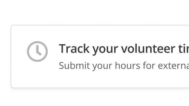
Use SkyIcon for decorative icons that are supplemental to the copy with which they're paired.
# SkyClickableIcon Base
Use SkyClickableIcon for interactive icons. SkyClickableIcons are brand-colored to show interactivity.
# API for Vue Components
# SkyIcon
Props
Slots
# SkyClickableIcon
Props
Scoped Slots