# Progress Steppers
The progress stepper is a navigational element that helps the user understand their progress through a multi-step task.
# Usage
Use a progress stepper to:
- Break up a long or complex process into smaller, more manageable steps. Progress steppers must include at least three steps
- Provide a clear and intuitive way for users to understand where they are in the task flow, and how much further they have to go
- Allow a user to navigate through the task by selecting steps (optional depending on form validation requirements)
A progress stepper can be used on a multi-page form where the step link takes the user to a new page, or a single-page form, where the step links scroll to different sections on the same page. For single page forms, ensure that the progress stepper remains sticky as the page scrolls.
Do
Don't
# Variants
# Type
Three types of progress steppers are available:
- Numeric
- Ordered
- Unordered
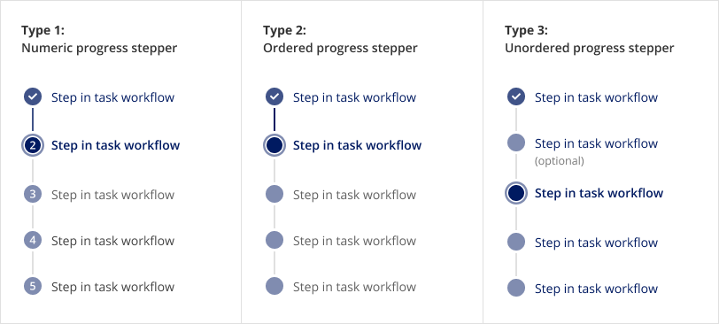
Use the table below to determine which option is better for your context:
| Numeric | Ordered | Unordered | |
|---|---|---|---|
| UI: Step circle | Includes number | Does not include number | Does not include number |
| UI: Progress line | Shows task progress by changing colour of connector line | Shows task progress by changing colour of connector line | Does not show task progress and connector line remains grey |
| Task flow and navigation |
|
|
|
| Required steps | All steps in the task flow are required | All steps in the task flow are required | Some steps in the task flow may be optional |
| Conditional logic | Not recommended. The number of steps should remain static throughout the task flow | Supported. Steps can be added based on previous submissions | Supported. Steps can be added based on previous submissions |
| Use cases |
|
|
|
# Orientation
Horizontal and vertical options are available.
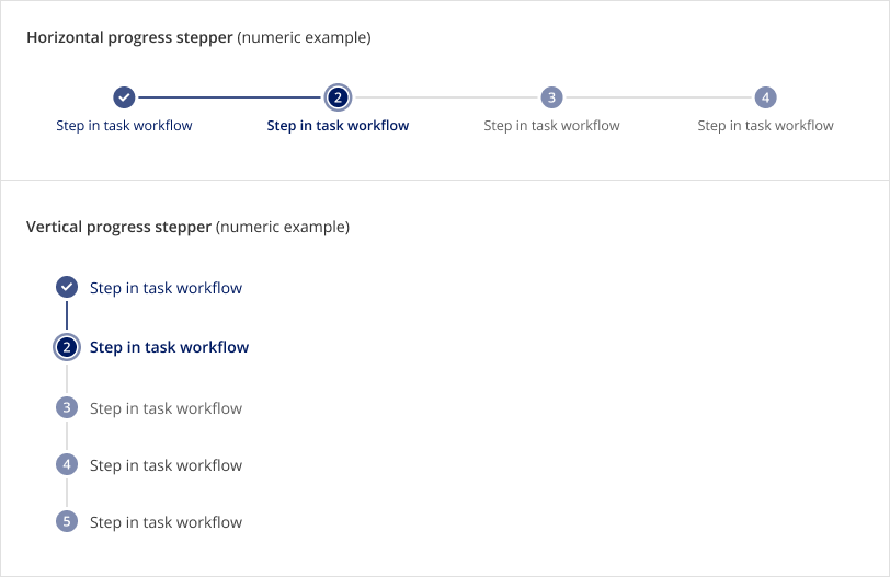
Use the table below to determine which option is better for your context:
| Vertical | Horizontal | |
|---|---|---|
| Number of steps | Max 8 (recommended) | Max 4 |
| Use cases | Recommended for 2 column page layouts | Recommended for 1 column page layouts |
# Design
# Anatomy
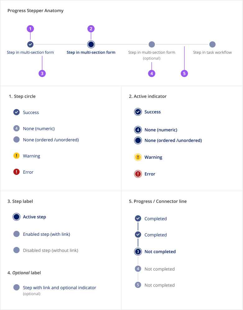
- The Step circle indicates step status. By using these different states, a progress stepper provides users with an understanding of their progress through a task. Step statuses include:
- Success: A completed step, indicated by a checkmark icon in circle
- None: An incomplete, or in progress step, indicated by an empty circle / with number (numeric only)
- Warning: An incomplete step that needs attention, indicated by a yellow circle with an exclamation mark icon.
- Error: An incomplete step with a validation error, indicated by a red circle with an exclamation mark icon.
The choice of warning or error will depend on the context of your form and validation. Recommendation: Where appropriate, use the corresponding SkyAlert on the form page/section to communicate action required by the user.
- The Active indicator is a stroke outlining the step circle of the current step the user is on.
- The Step label communicates the purpose of the step. If the step is not disabled, the label is linked to allow the user to navigate between steps. Note that in numeric and ordered variants, future steps must be disabled.
- The Optional label communicates if a step is not required. This only applies to the unordered variant of the progress stepper.
- The Line visually connects the step circles and may indicate progress through the task flow. It can be displayed as a:
- Grey connector line:
- In a numeric or ordered stepper, connects incomplete steps in the task flow
- In an unordered stepper, only visually connects steps
- Brand coloured progress line:
- In a numeric or ordered stepper, indicates that the user has moved past the previous step in the task flow
- Not available in an unordered stepper
- Grey connector line:
# Style
| Element | Colour | Details |
|---|---|---|
| 1a. Step circle: Success | Brand - 75% opacity | Includes white checkmark icon |
| 1b. Step circle: None | Brand - 50% opacity | Includes white number (numeric stepper type only) |
| 1c. Step circle: Warning | Yellow hue | Includes brand blue (hard coded/not white-labelled) exclamation mark |
| 1d. Step circle: Error | Red hue | Includes white exclamation mark |
| 2. Active indicator | 50% opacity of step circle colour | Active “ring” has a width of 2px and is offset 2px from the step circle |
| 3a. Label: Default (with link) | Brand | Text style: SkyText (vertical stepper), SkyText Sm (horizontal stepper) |
| 3b. Label: Disabled (no link) | Gray 700 | Text style: SkyText (vertical stepper), SkyText Sm (horizontal stepper) |
| 4. Optional label | Gray 600 | Text style: SkyText Sm |
| 5a. Connector line | Gray 300 | Width: 2px |
| 5b. Progress line | Brand - 75% opacity | Width: 2px |
# Spacing
Spacing between and around steps is defined within the component. To ensure consistency across products, do not adjust any spacing properties.
# Placement
# Vertical progress stepper
- The vertical progress stepper should always be left aligned within its container
- It should ideally be used in a 2 column page layout, placed to the right of the primary form/page content
- When used on a single-page form, where the step links scroll to different sections on the same page, the progress stepper should remain sticky as the page scrolls
- In responsive view, the progress stepper should be placed above the form content
# Horizontal progress stepper
- The horizontal progress stepper should always be center aligned within its container
- It should only be used above form/page content. Do not place it in a sidebar
# Content
Make the progress stepper easy to read and scan.
Do
The component has the following labels built in. Do not manually write these strings in. Use the built in strings.
- The completion sentence, Completed # of # steps (mobile and tablet breakpoints)
- The Show/Hide details button labels (mobile and tablet breakpoints)
- The optional label on a step, (optional)
- The Progress stepper aria-label for the progress stepper navigational element
- The step aria-label which has the status of the step, the step label, and whether it is optional. The labels for the step statuses are:
- Completed when the step has been completed successfully (status = success)
- Incomplete when the step status has not been completed yet (status = none)
- Incomplete with errors, needs attention when the step has an error (status = error)
- Incomplete, needs attention when the step status has a warning (status = warning)
# Behaviours
# Interactions
The progress stepper has the following interactions:
- A step is a link that will either open a page or scroll to a section on the same page when clicked
- If the step is disabled, it is not a link and will not trigger navigation. It is a button with disabled styling and has
aria-disabledset to true. It is kept as a button so that it can continue to be discoverable when using keyboard navigation (see Accessibility for more details) - If a horizontal progress stepper is used with more than 4 steps, the progress stepper can be expanded or collapsed using the Show/Hide details button. This is the same interaction when the progress stepper is at mobile or tablet breakpoints
# Functionality
The progress stepper has the following functionality built-in:
- For numeric and ordered progress steppers, future steps are disabled by default and cannot be overridden. This ensures that the steps are completed in sequential order
- For numeric and ordered progress steppers, all steps are required and can’t be displayed as optional
- A step can’t be both active and disabled. If this is the case, the active state is ignored and the step is disabled
# Responsive behaviours
# Mobile
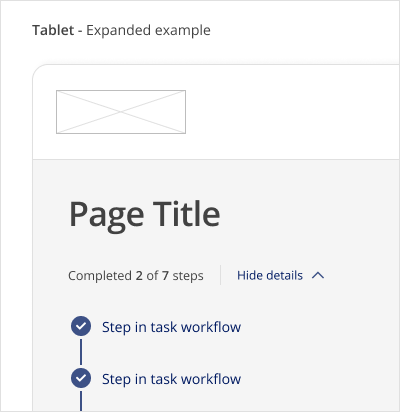
At tablet and mobile breakpoints, there is a step completion sentence that indicates the user’s progress and the steps in the progress stepper are collapsed by default. The steps are shown vertically when the Show/Hide details button is pressed.
Responsive behaviour is the same for both vertical and horizontal stepper types.
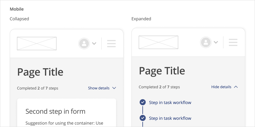
# Tablet
Same behaviour as mobile, but placement of the Show/hide details button is right next to step completion sentence.
# Desktop
At a desktop breakpoint, the steps are always visible.
# Edge cases
- Long labels: Very long labels in a step are truncated after 2 lines and an ellipsis is shown. The width of the label is fixed in desktop and is full width at mobile/tablet breakpoints.
# Accessibility
# What Skyline provides
# Colour and contrast
Icons in circles have appropriate contrast to be legible for users with visual impairments.
# Keyboard interaction
The steps in the progress stepper can be navigated to using Tab and Shift+Tab. All steps (regardless if they are the active step or in a disabled state) can be navigated to this way to improve their discoverability since they won’t be removed from the page’s focus order.
The Show/Hide details button at mobile/tablet breakpoints can also be navigated to using Tab and Shift+Tab. Pressing Enter or Space will show and hide the steps in the progress stepper.
# HTML semantics and attributes
Implemented HTML semantics to highlight:
<nav>specifies that the contents of the component are used for navigation<ol>defines an ordered list for the numeric and ordered variants of the progress stepper<ul>defines an unordered list for the unordered variant<li>defines the list items (the steps) in the progress stepper<a>is used for each step link. If a step is disabled, a<button>is used instead so that a user can’t navigate to the link, but it is still tabbable for discoverability (seearia-disabledattribute usage below)
The following attributes are built in:
aria-labelon the<nav>element describes that the navigation area is used as a progress stepperaria-labelfor a step includes the step status, provided step label, and whether it is optional (see Content section section for provided labels)aria-disabledis set on a<button>when a step is disabled. Note that thedisabledattribute is intentionally not used so that the disabled step continues to be discoverable within the page’s focus order andaria-disabledwill communicate that it cannot be interacted with (see MDN documentation on aria-disabled (opens new window) for more details)aria-current=stepis set on the active step to signify that it is the current steparia-hiddenis set on the sub-elements in the step so that they are not repeated (the details are already communicated in thearia-labelfor the whole step)
When the steps are collapsible, these attributes are included:
role=groupis set on the collapsible area which holds the stepsaria-labelledbyon the collapsible area is set to the id of the completion sentencearia-expandedon the Show/Hide details button is set to signify if the steps are expanded or collapsedaria-controlson the Show/Hide details button is set to the id of the collapsible arearole=presentationis used for the decorative chevron icon in the Show/Hide details button since thearia-expandedattribute along with the button label already communicates whether it is expanded or not
# Development guide
# Focus management
In single page applications, when a step is clicked, the user should be navigated to that step and the focus should be programmatically moved to the contents for that step. This applies to both cases when a step has a link to a different page, or a link to a different section on the same page. Note that this is not needed in multi-page applications where the browser will reload the page for the selected link and the focus will be reset to the start of the page.
# Code
# Examples
# Vertical progress stepper
# Horizontal progress stepper
# Progress stepper variants: numeric, ordered, and unordered
# Progress stepper step statuses (success, error, warning, none)
# Progress stepper step states (active, optional, disabled)
# API for Vue components
View Type Definitions for more details on the prop types.
# Type definitions
import { Routable } from 'types'

export enum ProgressStepperStepStatus {
  ERROR = 'error',
  WARNING = 'warning',
  SUCCESS = 'success',
  NONE = 'none',
}

export enum ProgressStepperVariant {
  NUMERIC = 'numeric',
  ORDERED = 'ordered',
  UNORDERED = 'unordered',
}

export enum ProgressStepperOrientation {
  HORIZONTAL = 'horizontal',
  VERTICAL = 'vertical',
}

export type ProgressStepperStep = {
  label: string
  optional?: boolean
  disabled?: boolean
  status?: ProgressStepperStepStatus
  completed?: boolean
} & Routable
export type Routable = {
  // Links the component to a route defined by Vue Router
  to?: string | Location
  // Links the component to a URL
  href?: string
  // ... Other HTML anchor element or Vue Router attributes
} & Partial<HTMLAnchorElement>