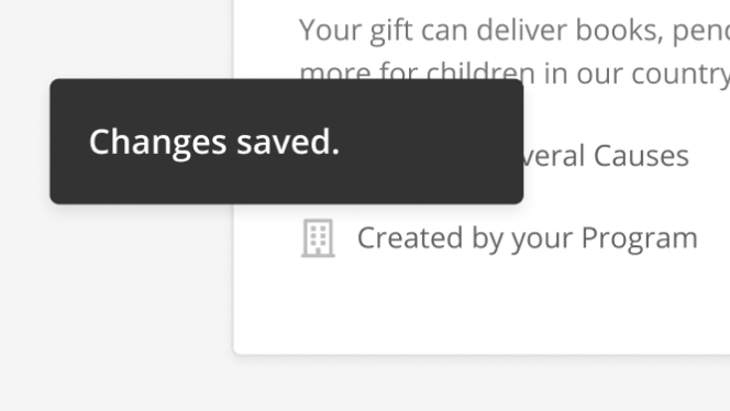
# Toasts
A message that appears at the bottom of the interface to provide feedback to a user's action in a non-disruptive manner
# Design Best Practices
Do
Don't
# Layout & Spacing
# Desktop
# Mobile
# Accessibility Considerations
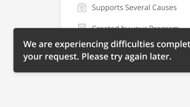
Avoid using for critical information because:
- It disappears automatically.
- The toast by default will show for either 5 seconds or 500ms * word count, whichever is larger.
- Toast can’t be easily accessed with a keyboard.
Toasts have an implicit role="status" so they will announce themselves to
screen readers when they are mounted on the page.
# Animation
The motion characteristics for toasts are included within the component.
When a toast becomes visible, it slides in from the left edge of the screen and then fades out after a delay.
- Enters: 500ms duration and the cubic easing function, slide left to right
- Exit: 200ms duration and the cubic leave easing function, fade out
The length of the delay is 5-seconds by default. If a toast's word count is multiplied by 500ms and the total exceeds 5-seconds, that total will become the duration.
# Examples
# Base Toast Component
# Show a Toast
# Show a Toast using the Vue Mixin
# API
# useToaster Composable
The useToaster composable function is available for components built using the
composition API.
# ToasterMixin
For components that are built with the options API, there is a ToasterMixin available, which exposes the same methods as the composable.
# SkyToast
# Type Declarations
import { ComputedRef } from '@vue/composition-api'

export interface Toast {
  id: string
  message: string
  autoDismiss: boolean
  onDismiss: null | (() => void)
}

export interface ToastOptions {
  message: string
  immediate?: boolean
  autoDismiss?: boolean
  onDismiss?: () => void
}

export interface Toaster {
  showToast: (options: ToastOptions) => string
  dismissToast: (id: string) => void
  toasts: ComputedRef<Toast[]>
}