# Cards
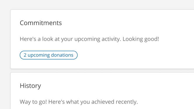
Group similar content together, and to assist with responsive layout
# Design Best Practices
Do


Don't


# How to
There are two approaches for cards. Which one is best will depend on your use case.
# Option A
Card Sections are useful if:
- You need to make use of any of these more complex card styles
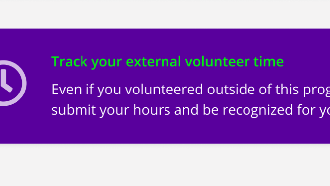
- Muted Section with a gray section background.
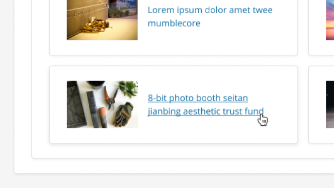
- Hero 16:9 with a 16:9 image in it.
- Hero 4:3 with a 4:3 image in it.
- Header Section with the default card title styling.
- You want to have multiple sections of content within one card component and keep it organized.
# Option B
Card with Padding is useful if:
- You want the default card padding around all edges. None of the content needs to go right to the end of the card.
- The content within your card is pretty simple, e.g. just a paragraph.
# Not sure if you should use a card?
Remember that many components can have similar properties of a card, but not actually use the card component (for example the Dropdown Menu).
Only use the c-card component if you need to:
- Leverage built-in default padding (24px top/bottom and 28px left/right)
- Have the card default box shadow, border radius and title styling
- Make use of the extra benefits of the 'Sections' functionality as outlined below