# Containers
Group content into cohesive units
# Usage
The container is a flexible layout component used to group content into cohesive units on a page.
# Design
# Anatomy
The container is used to group content but the (coded) component itself is empty.
Content is shown within the container examples on this page to illustrate available component properties and common usage.
# Padding
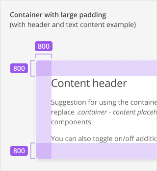
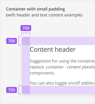
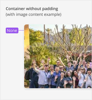
A container can have one of three predefined padding sizes: Large, Small or None.
| Padding size | Value |
|---|---|
| Large padding size | 800 / 32px around content |
| Small padding size | 700 / 28px around content |
| None | 0px around content |
Padding size roughly correspond to container size, meaning larger containers that are used for primary content within a page layout, should have the large padding size applied. Conversely, smaller containers used for secondary content (i.e. within a sidebar), should use the small padding size.
Note: On mobile, the responsive behaviour of large containers will result in them taking on small padding size as well.
In use cases where content has to stretch across the full width of a container, padding size can be set to none. Use this option sparingly.
# Style
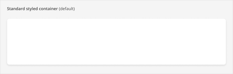
Three container style types are available: Standard (the default styled container), Unstyled, and Muted.
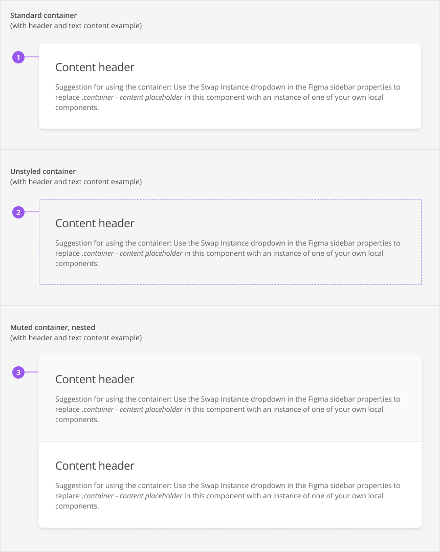
# 1. Standard (default)
The standard container variant has the following style properties:
| Property | Value |
|---|---|
| Background color | White |
| Border | 1px |
| Border color | Gray 200 |
| Border radius | 8px |
| Box shadow | 200 |
# 2. Unstyled
The unstyled container has none of the visual properties of the standard variant.
# 3. Muted
A muted container has no styling applied to it except for a background color. This variant can currently only be used as part of a nested container.
| Property | Value |
|---|---|
| Background color | Gray 100 |
# Nested containers
Two or more containers can be nested within a parent container to provide flexibility in page layouts.
When containers are nested, the outer parent container:
- always has standard styling
- always has no padding applied
When containers are nested, the inner child containers:
- have no styling applied
- may or may not have padding applied
- are visually separated by a divider line
# Muted containers
One of the nested child containers may have muted styling applied to provide contrast. Use this sparingly and don’t apply this style to all child containers.
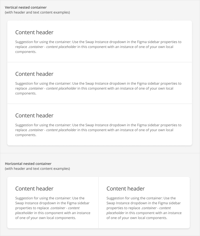
# Vertical vs horizontal containers
Nested containers may be stacked vertically or horizontally. Horizontally stacked containers should not exceed 3.
# Behaviours
# Responsive Behaviour
# Mobile
On mobile, containers with large padding will take on the small padding size. The contents in the containers must be implemented responsively on a case-by-case basis.
# Accessibility
# Development Guide
The context of the container and how it is used will determine what accessibility considerations there are and which HTML attributes need to be applied. A common use case is defining a container that groups content together with a HTML region role (opens new window).