# Page Layouts
Tools for laying out a page of content in consistent and accessible ways.
# Design Best Practices
Do
Don't
# How to
# Choosing the appropriate layout
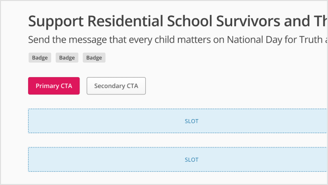
The layout has two main sections:
- The header, which is consistent across all templates
- The content area, which is different depending on which layout you need
The header contains a title, as well as the option of adding:
- A
subtitlefor supporting information - A
button slotto hold any important actions that a user might quickly need to access, such as your primary call to action, admin-related or share buttons. - An additional open slot for anything else you might need, such as a cluster of badges.
Which content area you need will depend on the type of content you are designing for.
# One column layouts
# Two column layouts
# Other layouts
# Figma Tips and Tricks
- Do not change the layer names in the template.
- To input customised local components into the Figma template slots, make sure to have Auto Layout applied and set to Fill Container.
- Deviating from the template provided will cause issues. The template is designed to inform technical build specifications. Don't change it.
# Examples
# Two Column Layout with Sidebar at the End - Desktop
# Two Column Layout with Sidebar at the End - Mobile
# Two Column Layout with Sidebar at the Start - Desktop
# Two Column Layout with Sidebar at the Start - Mobile
# One Column Layout
# API for Vue Components
# SkyTwoColumn
Props
Slots
Events
# SkyOneColumn
Props
Slots