# Page
Defines the structure for a page
# Usage
The Page component is a layout element that is used to define the overall structure and content of a page or screen within Benevity applications. It typically includes elements such as a page title, main content area, and a footer, as well as any other elements that are specific to the page or screen.
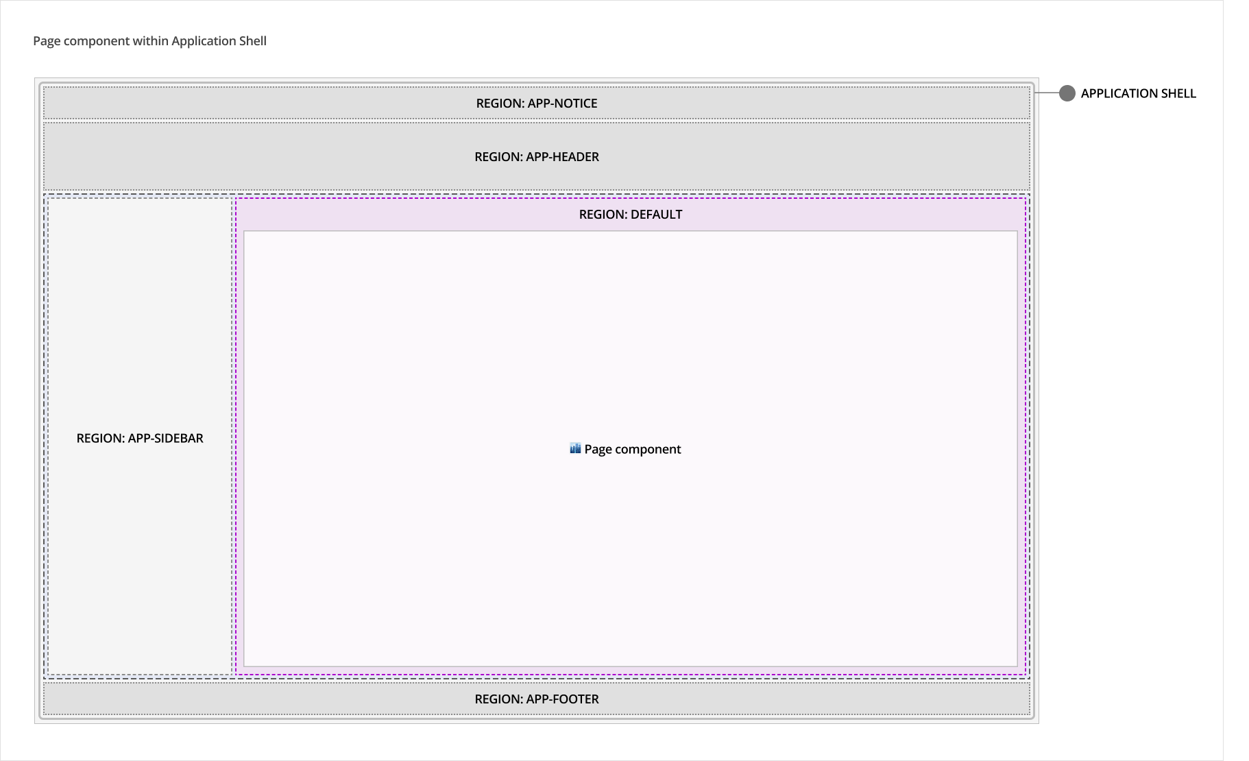
The Skyline Page is a standalone component but should ideally be used in conjunction with the Application Shell where it is lives in the default region.
# Design
# Anatomy
# Regions
The Page component consists of its own following regions:
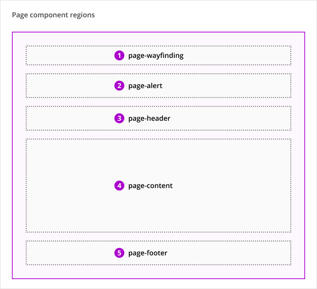
- page-wayfinding: Use only for the Breadcrumbs or Back Button components.
- page-alert: Use only for the Alert component.
- page-header: Use only for the Page Title component. Additional components may be added in the future.
- page-content: Dedicated to page- or screen-specific elements and content, including text tabs, containers with text, tables or images, cards, etc.
- page-footer: Reserved for future use of the Page Footer component (not available yet). The Page Footer will contain textual content like copyright information, legal and support links.
# Spacing
Spacing around and between regions are defined in the Page component, including different breakpoint adaptations. To ensure visual consistency between pages, these values should not be changed.
# Outer padding
The padding around regions use the following values:
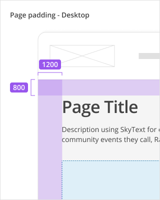
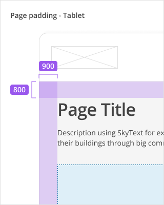
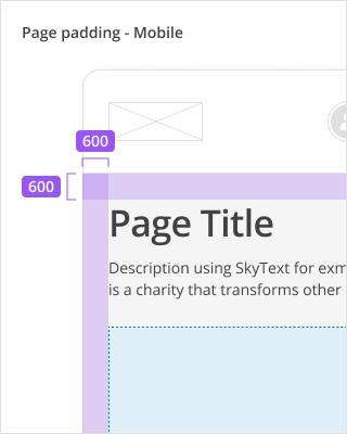
| Area | Desktop Spacing | Tablet Spacing | Mobile Spacing |
|---|---|---|---|
| Top and bottom padding | 800 (32px) | 800 (32px) | 600 (24px) |
| Left and right padding | 1200 (48px) | 900 (36px) | 600 (24px) |
# Padding between regions
The padding between regions vary depending on the regions in use. Do not adjust the values defined in the component.
# Sizing
To ensure optimal content layout at all breakpoints, the Page component and its regions have maximum widths defined, which should be adhered to in the majority of cases.
The maximum widths defined for the Page component/regions when used without vertical navigation:
| Component/ Region | Desktop max-width | Tablet max-width | Mobile max-width |
|---|---|---|---|
| Page component | 1280px | None - 100% | None - 100% |
| 1. page-wayfinding | 904px | None - 100% | None - 100% |
| 2. page-alert | 904px | None - 100% | None - 100% |
| 3. page-header | None - 100% (1280px) | None - 100% | None - 100% |
| 4. page-content | None - 100% (1280px) | None - 100% | None - 100% |
| 5. page-footer | None - 100% (1280px) | None - 100% | None - 100% |
The maximum widths defined for the Page component/regions when used with vertical navigation:
| Component/ Region | Desktop max-width | Tablet max-width | Mobile max-width |
|---|---|---|---|
| Page component | None - 100% | None - 100% | None - 100% |
| 1. page-wayfinding | 904px | None - 100% | None - 100% |
| 2. page-alert | 904px | None - 100% | None - 100% |
| 3. page-header | 904px (default) or 100% in limited scenarios * | None - 100% | None - 100% |
| 4. page-content | 904px (default) or 100% in limited scenarios * | None - 100% | None - 100% |
| 5. page-footer | 904px (default) or 100% in limited scenarios * | None - 100% | None - 100% |
* When using the Page component with the vertical navigation, an exception allows for adjusting the default fixed widths of page-header, page-content and page-footer to a full width layout, but only to accommodate the following scenarios:
- pages with dense data tables
- reporting interfaces
- select grid layouts (future state)
The 3 regions are all adjusted to full-width and cannot be adjusted independent of one another.
# Behaviours
# Responsive behaviour
Depending on the breakpoint, the spacing around and between the page regions will adapt responsively.
# Accessibility
# Development guide
# HTML semantics and attributes
The page component only defines the regions for the page layout and the components placed in these regions should use the proper HTML semantics.