# Breadcrumbs
Shows the current location within the application hierarchy and allows navigation to a previous level
# Usage
Breadcrumbs can be used as a way for users to navigate back to previous pages in the site hierarchy. It also helps the user to see their current location within the context of the overall hierarchy to understand the relationship between the current page and the rest of the site or application. Breadcrumbs should never be the primary navigation.
Do
Don't
# Design
# Anatomy
Breadcrumbs show as a trail of links, or ancestors, that represent site hierarchy. Each breadcrumb item is separated by a chevron “>” icon.
- When there are 5 or fewer breadcrumb items, all of them are shown in the trail.
- When there are more than 5 breadcrumb items, all items but the first, second last, and current page breadcrumbs, are hidden and replaced with an expansion button (ellipses) that will show all the items when clicked.
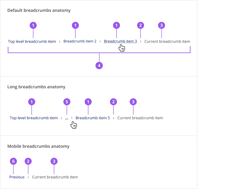
- Ancestor breadcrumb item: These are linked items that navigates the user back up the hierarchy
- Separator: A chevron separating each item. This is a set icon and should not be changed
- Current page breadcrumb item: This item is not linked
- Breadcrumbs trail: All of the breadcrumb items
- Ellipses: An expansion link that shows entire breadcrumb trail when clicked
- Previous: This is a link to the direct ancestor of the current page
# Style
| Element | Colour | Underline | Font size |
|---|---|---|---|
| Breadcrumb link: Default state | Brand | None | 12px |
| Breadcrumb link: Hover | Brand | Yes | 12px |
| Breadcrumb item without link | Gray 800 | None | 12px |
| Chevron separator | Gray 800 | N/A | N/A |
# Spacing
# Component Spacing
Spacing between and around breadcrumb items is defined within the component and will automatically adjust at the mobile breakpoint to increase the trigger area. To ensure consistency across products, do not adjust any spacing properties.
# Layout Spacing
Ideally, use the breadcrumbs as part of the Page component to ensure correct spacing and a consistent user experience.
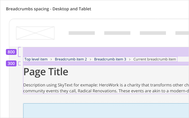
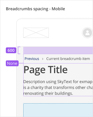
| Spacing | Desktop and tablet | Mobile |
|---|---|---|
| Between application header and breadcrumbs | 800 / 32px | 600 / 24px |
| Between breadcrumbs and page title | 300 / 12px | None / 0px |
# Placement
Breadcrumbs are located at the top of a page, above all page content including the page title and any alerts.
When used as part of the Page component, breadcrumbs must be placed within the page-wayfinding region.
# Alignment
Breadcrumbs are always left aligned, on both desktop and mobile devices
# Content
- Use the page title as the breadcrumb label.
- On mobile, the Previous label for the breadcrumb is built into the component with translations.
# Behaviours
# Responsive behaviour
# Mobile
The breadcrumbs component will only show a breadcrumb item to return to the previous page and the breadcrumb for the current page.
# Edge cases
- Many breadcrumb items: When there are more than 5 breadcrumb items, all items but the first, second last, and current page breadcrumbs, are hidden and replaced with an expansion button (ellipses) that will show all the items when clicked.
- Long labels: Very long labels in a breadcrumb item are truncated and an ellipsis is shown.
# Accessibility
# What Skyline provides
# HTML semantics and attributes
Implemented HTML semantics to highlight:
<nav>specifies that the contents of the breadcrumbs are used for navigation<ol>and<li>defines an ordered list for the breadcrumb items
The following attributes are used:
aria-labelon the<nav>element describes that the navigation area is used for breadcrumbsaria-labelon the ellipsis expansion button explains that this button will show more items in the breadcrumbsrole=presentationon separator icons used to separate breadcrumb items so they are not announced to screen readersaria-currentis set topagefor the last breadcrumb item, which represents the current active page
# Keyboard interactions
The breadcrumb items and expansion button (when there are too many breadcrumb items) can be navigated to using Tab and Shift+Tab. The expansion button can be pressed using Enter or Space to show the collapsed breadcrumb items.
# Focus management
When the expansion button is pressed to show more breadcrumbs, the focus is reset to the first breadcrumb item so that the user can go through all of the breadcrumb items once they are all shown.
# Development guide
# Focus management
In single page applications, when a link is clicked, the focus should be programmatically moved to the newly rendered content (i.e. the main content of the page that is updated). This is not needed in multi-page applications where the browser will reload the page for the selected link and the focus will be reset to the start of the page.
# Code
# Examples
# Breadcrumbs
# Breadcrumbs with many items
# API for Vue components
View Type Definitions for more details on the prop types.
# Type Definitions
type BreadcrumbItems = Array<BreadcrumbItem>

type BreadcrumbItem = {
  /**
   * Label for the breadcrumb item
   */
  label: string
  /**
   * Links the breadcrumb to a URL
   */
  href?: string
  /**
   * Links the breadcrumb to a route defined by Vue Router
   */
  to?: string | object
  // ... Other HTML anchor element or Vue router link properties
}
# Related
# Resources
- Research: