# Vertical Navigation
Provides navigation for a hierarchical context
# Usage
The vertical navigation component is an element that provides an easy way to access different sections and reach specific information within an application. It is the recommended navigation component for any new administrator-facing Benevity products to support a growing but cohesive and intuitive product ecosystem.
Use the vertical navigation in conjunction with the Application Shell component across all pages and screens of the application to ensure a consistent user experience.
A note on Information Architecture (IA)
How easily users will find information using the vertical navigation component will depend on the application’s information architecture.
Information architecture (IA) is the discipline of making information findable and understandable. It includes searching, browsing, categorizing and presenting relevant and contextual information to help people understand their surroundings and find what they’re looking for.
Where possible, review your IA before using this component to optimize navigation.
Do
# Design
# Anatomy
The vertical navigation component allows navigation through a maximum of 4 hierarchy levels.
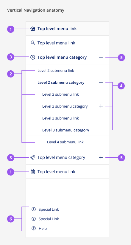
Menu links open pages when clicked. Menu links are the deepest item in a hierarchy. They cannot be expanded/collapsed.
- Top level menu link: A menu item that is at the top of the hierarchy and does not contain other items below it
- Submenu links: A menu item that is contained by at least one parent category but does not itself contain further items below it
Menu categories are labels that do not link to pages because they serve as containers for other menu items lower in the hierarchy. When clicked, a category opens to show submenu items.
- Top level menu category: A menu item that is at the top of the hierarchy and contains sub-level items
- Submenu category: A menu item that is contained by at least one parent category but also contains sub-level items itself
- Signifier: The plus/minus icons next to menu categories that - when clicked or tapped - expands or collapses the submenu items
- Special links: Special links are not part of the main navigation items hierarchy but allow the user to access important or support information. These links are aligned at bottom of sidebar, are smaller in size, and always have icons, even when other top level menu items do not have icons. A maximum of 3 special links can be accommodated:
- One of the special links slots is reserved for a predefined Help link that should navigate to the relevant help center. The Help link’s label and icon cannot be changed.
- The remaining two slots can be used for custom links. Review icon choice with the Skyline team.
Special links always opens a page and cannot have sub level items. A link that navigates the user to a page outside of the current application, should open in a new browser tab.
# Styling
# Variant: With or without icons
Do
Don't
# Placement
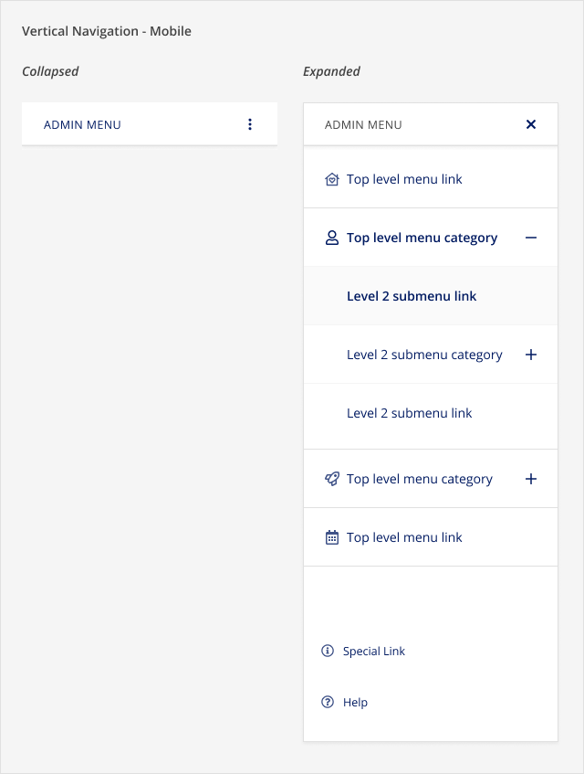
The vertical navigation should only be used on the left side of the screen, within the app-sidebar region of the Application Shell component. On mobile, the vertical navigation is collapsed and the button to expand it should show under the application header and before the main contents of the page.
# Content
Do
Don't
# Behaviours
# Interactions
The vertical navigation component has the following interactions:
- The top menu item should be selected by default. If the first top level category has sub-level items, the main landing page should be the first sub-level link in the category.
- A menu category expands or collapses when clicked to show or hide lower level menu items.
- A menu link opens a page when clicked. Do not use them as links to anchors for same page navigation between sections.
- Multiple menu categories can be expanded. When a link is clicked, all open top level categories will collapse except for the one that contains the active menu item.
- The navigation hierarchy cannot exceed 4 levels (Why? Read more about information architecture best practises)
# Responsive Behaviour
# Mobile
When the vertical navigation is at a mobile breakpoint, the menu items are collapsed by default and there is a labelled menu button to open the menu. Once pressed, the menu expands to fill the screen and shows a close button and the menu items. When the user presses the close button, the menu is collapsed and only the labelled menu button is shown again.
# Tablet
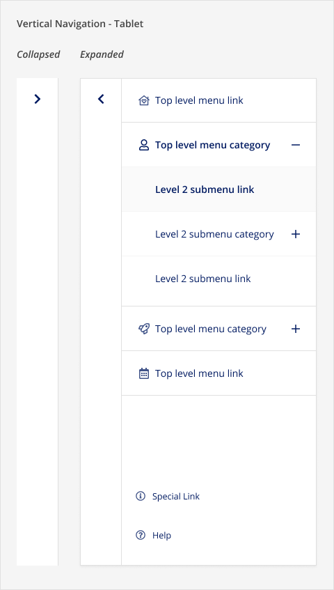
When the vertical navigation is at a tablet breakpoint, the menu items are collapsed by default and there is an expansion button to open the menu. Once pressed, an overlay is placed on the elements beside the expansion button, the menu slide into view, and the expansion button transitions into a collapse button. Once the collapse button is pressed, the menu slides out of view, the overlay is removed, and the collapse button transitions back to the expansion button.
# Desktop
At a desktop breakpoint, the menu items are always visible.
# Scroll behaviour
When there are many categories and links, a vertical scrollbar will be shown. When a category is expanded, the items within the category will be scrolled into view.
# Accessibility
# What Skyline provides
# Keyboard interactions
All categories and links can be navigated to using Tab and Shift+Tab. Categories can be expanded/collapsed using Enter or Space. If the vertical navigation component is shown at the mobile or tablet breakpoints, the buttons to open the vertical navigation menu can be navigated to using Tab and Shift+Tab and can be pressed using Enter or Space. The opened vertical navigation menu can be closed using Escape or by pressing the close button using Enter or Space.
# HTML semantics and attributes
Implemented HTML semantics to highlight:
<nav>specifies that the contents of the component are used for navigation<ol>and<li>defines an ordered list for the main items and the special links in the vertical navigation
The following attributes are used:
aria-labelon the<nav>element describes what the navigation area is used for. This is set using themenuLabelprop.aria-expandedis set on categories to signify whether they are expanded or collapsedaria-currentis set tolocationfor an active category andpagefor an active linkaria-labelon the expansion and collapse buttons in tablet and mobile with clear instructions that this button will open/close the menurole=presentationon decorative icons that should be ignored by screen readers. This is applied to the icons used to represent links and categories, as well as the expanded/collapsed icons on categories because this is communicated usingaria-expanded
# Focus management
When a vertical navigation menu is opened (in mobile or tablet), the focus is kept within the vertical navigation component until the overlay is closed.
# Reduced Motion
If a user has prefers-reduced-motion (opens new window) enabled, the transitions used in vertical navigation are disabled.
# Development guide
# HTML semantics
- Provide a label for the
menuLabelprop. This sets thearia-labelfor the vertical navigation and is also used as a visual label in mobile.
# Focus management
In single page applications, when a link is clicked, the focus should be programmatically moved to the newly rendered content (i.e. the main content of the page that is updated). This is not needed in multi-page applications where the browser will reload the page for the selected link and the focus will be reset to the start of the page.
# Code
# Examples
To view SkyVerticalNavigation at different responsive sizes, open the examples in Storybook or CodeSandbox.
# VerticalNavigation with Icons
# VerticalNavigation without Icons
# VerticalNavigation with an Active Item
# API for Vue Components
# SkyVerticalNavigation
View Type Definitions for more details on the prop types.
# Type Definitions
type SkyVerticalNavigationItem =
  | SkyVerticalNavigationLink
  | SkyVerticalNavigationCategory

type SkyVerticalNavigationLink = {
  /**
   * Include type: 'link' if the item is a link
   */
  type: 'link'
  /**
   * Unique identifier for the item
   */
  id: string
  /**
   * Label to show for the item
   */
  label: string
  /**
   * An icon component to use for the item (optional - only supported on top level items)
   */
  icon?: Object
  /**
   * Links the item to a URL
   */
  href?: string
  /**
   * Links the item to a route defined by Vue Router.
   */
  to?: string | Object
  /**
   * Whether the item is the current link
   */
  active?: boolean
  // ... Other HTML anchor element or Vue Router attributes
}

type SkyVerticalNavigationCategory = {
  /**
   * Include type: 'category' if the item is a category
   */
  type: 'category'
  /**
   * Unique identifier for the item
   */
  id: string
  /**
   * Label to show for the item
   */
  label: string
  /**
   * An icon component to use for the item (optional - only supported on top level items)
   */
  icon?: Object
  /**
   * The items that belong in the category
   */
  items: SkyVerticalNavigationItem[]
}

type HelpItem = {
  /**
   * Unique identifier for the item
   */
  id: string
  /**
   * Links the item to a URL
   */
  href?: string
  /**
   * Links the item to a route defined by Vue Router.
   */
  to?: string | Object
  /**
   * Whether the item is the current link
   */
  active?: boolean
  // ... Other HTML anchor element or Vue Router attributes
}

type SpecialItem = {
  /**
   * Unique identifier for the item
   */
  id: string
  /**
   * Label to show for the item
   */
  label: string
  /**
   * An icon component to use for the item (required for special items)
   */
  icon: Object
  /**
   * Links the item to a URL
   */
  href?: string
  /**
   * Links the item to a route defined by Vue Router.
   */
  to?: string | Object
  /**
   * Whether the item is the current link
   */
  active?: boolean
  // ... Other HTML anchor element or Vue Router attributes
}
# Related
# Resources
- Research: