# Back Button
A standardized button that allows a user to navigate back to the previous page.
# Usage
Use the back button in a workflow that requires a way for the user to return to a previous page, and there is no other navigation that allows them to get there.
Don't
# Design
# Anatomy
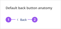
- Icon: A left chevron, always left aligned to the link text
- Link: Standard link that takes the user back to the previous page in the workflow
# Style
The icon and spacing has been customized for the purpose of this component and should not be changed. Both the icon and link should always use the brand colour.
# Placement
The back button must be located at the top of a page, above all page content including the page title and any alerts.
When used as part of the Page component, the back button must be placed within the page-wayfinding region.
# Spacing
# Layout spacing
Ideally, use the back button as part of the Page component to ensure correct spacing and a consistent user experience.
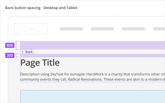
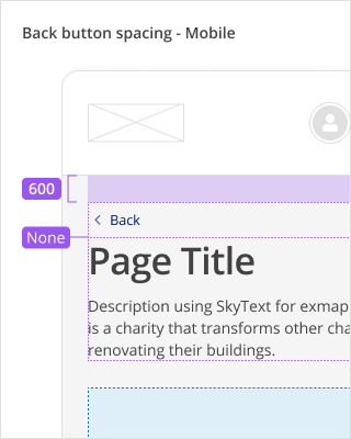
| Spacing | Desktop and tablet | Mobile |
|---|---|---|
| Between application header and back button | 800 / 32px | 600 / 24px |
| Between back button and page title | 300 / 12px | None / 0px |
# Alignment
The back button is always left aligned, on both desktop and mobile devices.
# Content
- The "Back" label for the back button component is built in with translations.
- Keep the label to just "Back". Do not add additional copy, like the name of the previous page. The value in adding more copy is outweighed by the added work for translations, and the risk of inconsistent capitalization and phrasing across different product pages.
# Behaviours
# Interactions
Pressing the back button will navigate the user to the link it was provided with.
# Accessibility
# What Skyline provides
# HTML Semantics and attributes
Implemented HTML semantics to highlight:
- An anchor tag (
<a>) is used when the back button is provided with a link
The following attributes are used:
role=presentationis used on the left chevron icon in the back button component since it is decorative
# Keyboard interaction
The back button can be navigated to and pressed using the keyboard.
# Development guide
# Focus management
In single page applications, when a link is clicked (in this case, the back button), the focus should be programmatically moved to the newly rendered content (i.e. the main content of the page that is updated). This is not needed in multi-page applications where the browser will reload the page for the selected link and the focus will be reset to the start of the page.