# Application Shell
Provides consistent and reliable site-wide structure.
# Usage
The application shell provides consistent and reliable site-wide structure.
We recommend using the full width application shell when you are creating new products, new product pages or creating the root template for your application.
# Design
# Anatomy
The application shell component provides site-wide structure. As the name suggests, it does not refer to the site content, but the outer site shell, which includes defined regions.
# Regions
Regions are page areas, dedicated to specific components or content types. The application shell consists of the following:
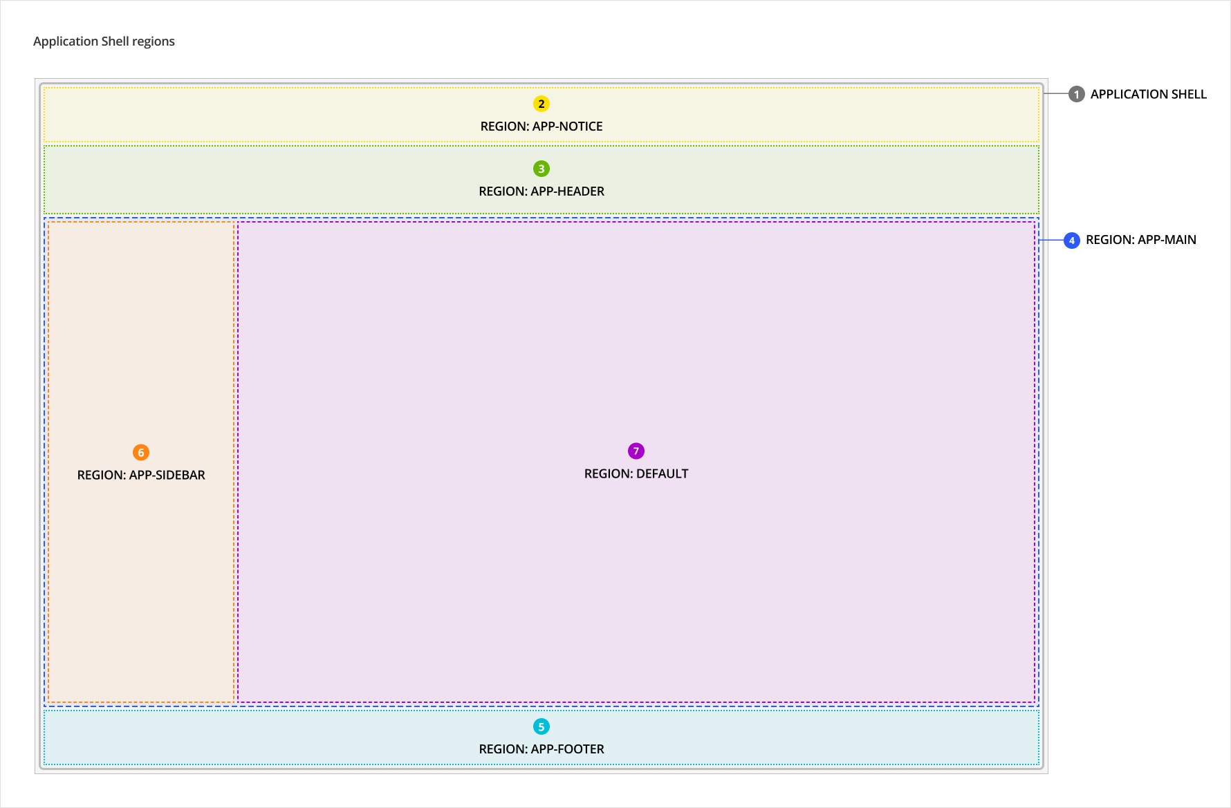
- Application Shell
- app-notice (optional): Reserved for future use.
- app-header: Use only for site-wide navigation, site logo, and profile links. This region is always sticky.
- app-main: Use only for the App Main component, which consists of sub-regions that contains content.
- app-footer (optional): Reserved for future use. Footers containing textual content like copyright information and support links, should be included in the page-footer region of the Page component.
The app-main region consists of the App Main component which has the following sub-regions:
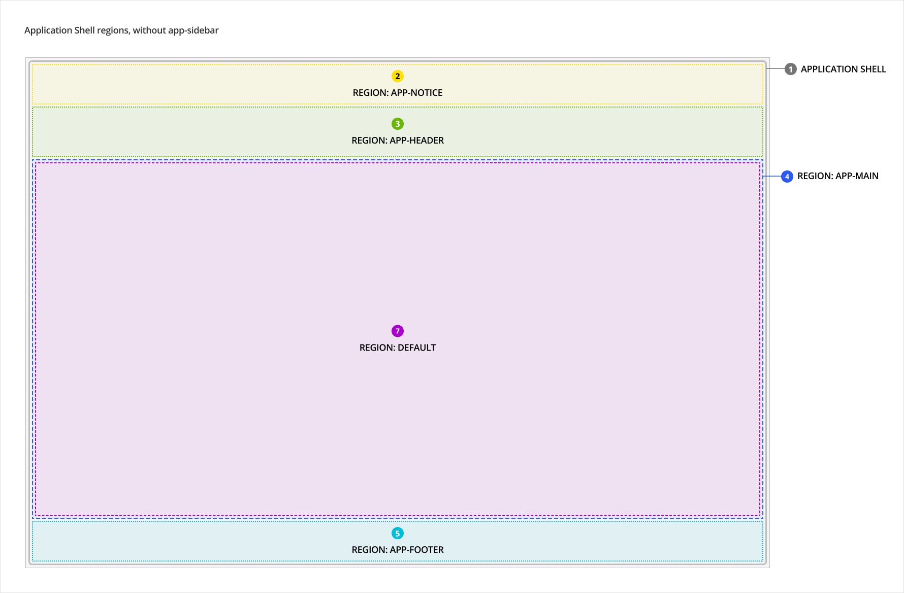
- app-sidebar (optional): Use only for Vertical Navigation component. Where possible, future admin-facing interfaces (for clients and causes) should have a vertical navigation on the left to promote a cohesive experience between our products.
- default: Reserved for the Page component that contains page content.
If a site does not include the dedicated component for a specific region, that region can be omitted.
For example, the app-sidebar region must only be used to hold the vertical navigation component. If a site does not have a vertical navigation, the app-sidebar region can be left out.
# Style
Do not apply styling to application shell regions. Padding, margins and background are specified in the components used within regions.
# Sizing
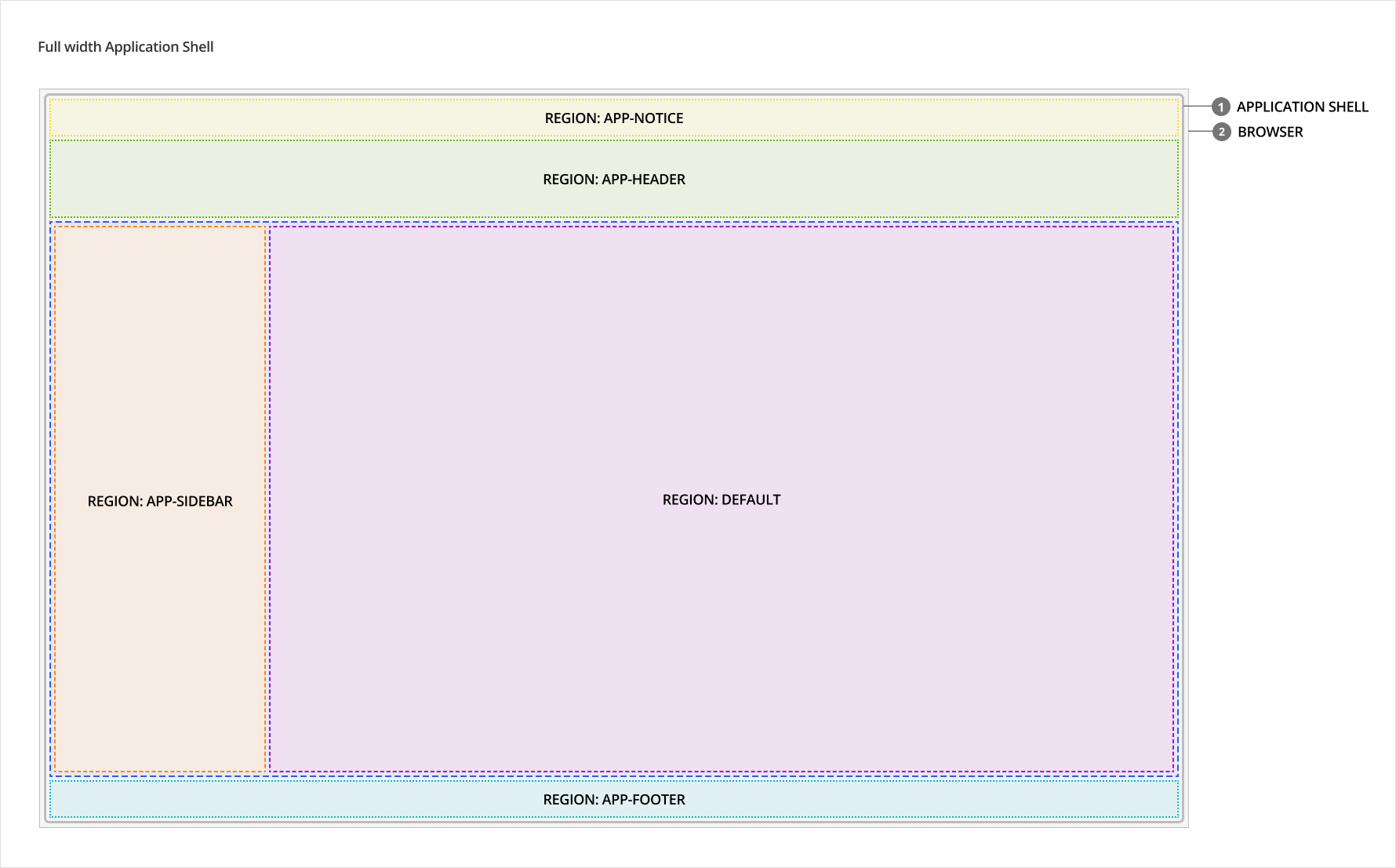
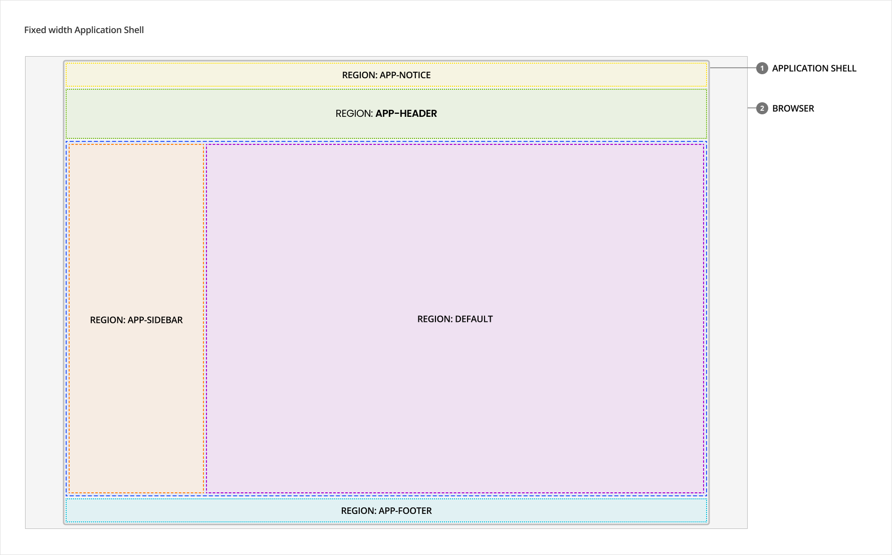
# Full vs fixed width
Depending on the product, the application shell could be full or fixed width. The width option will be applied site-wide where the application shell is used.
Use the full width application shell where possible. The fixed width option is intended only to accommodate certain current product scenarios. Going forward, full width will be the default (and ideal) state for all new or updated products.
# Content
- Content should be placed in containers and not within regions
- A "Skip to main content" button is provided by the application shell. The label and it's translations are built in and can be overridden, if necessary.
# Behaviours
# Responsive behaviour
# Mobile
At mobile breakpoints, the app-sidebar and default regions are vertically stacked instead of horizontally placed beside each other to accommodate less horizontal space on mobile devices.
# Accessibility
# What Skyline provides
# Focus management
The application shell includes a hidden “Skip to Main Content” button that is only visible when it is focused. Pressing this button moves the user’s focus to the main content of the page. The main content of the page is the element that is bound to app-main slot props for SkyAppShell. This is useful functionality for keyboard and screenreader users who want to jump right into the contents of a page.
# Keyboard interactions
The “Skip to Main Content” button provided by the application shell can be navigated to using a keyboard and it should be the first focusable element on the page. When the user presses this button, the user is brought to the main contents of the page and should be able to continue navigating the main content region using the keyboard.
# Development guide
# HTML semantics & attributes
- Make sure to bind slot props to the corresponding elements (see scoped slots documentation for more details). This ensures functionality like the “Skip to Main Content” button work properly.
- The application shell only defines the regions for the application layout and the components placed in these regions should use the proper HTML semantics. For example:
- the
app-headerregion should be provided with a component that has a<header>HTML element - the
app-mainregion should be provided with theSkyAppMaincomponent (which provides the<main>HTML element)
- the
# Code
# Examples
# SkyAppShell
# SkyAppShell and SkyAppMain
# SkyAppShell, SkyAppMain and SkyPage
SkyPage can be used with SkyAppShell and SkyAppMain.