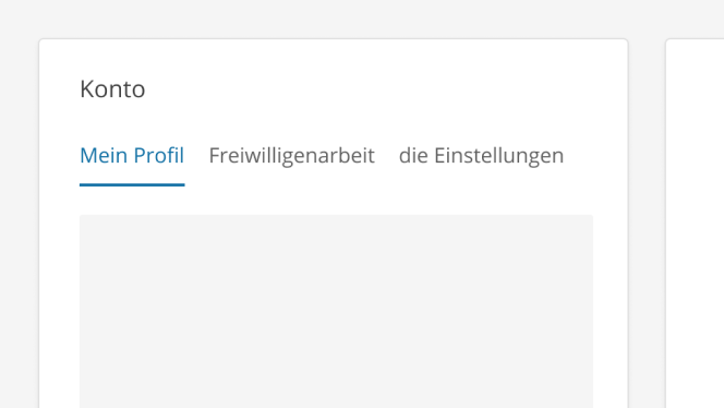
# Text Tabs
Organize related content within a specific page to help users find what they're looking for, without creating any visual clutter
# Design Best Practices
Do
Avoid
Don't
# Layout & Spacing
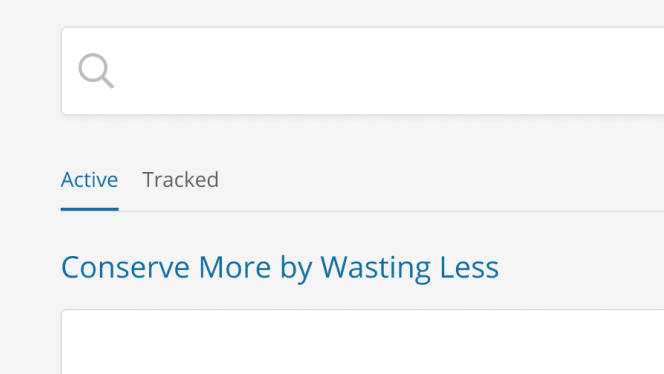
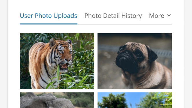
# Examples
# Base
The ideal state when all content is visible in the viewport.
# Responsive
When the viewport can no longer hold the contents, the remaining tabs are removed from the initial tab list and added into the More menu.
# API for Vue Components
# SkyTextTabs
Props
Slots
Events
# SkyTextTabsPanel
Props
Slots